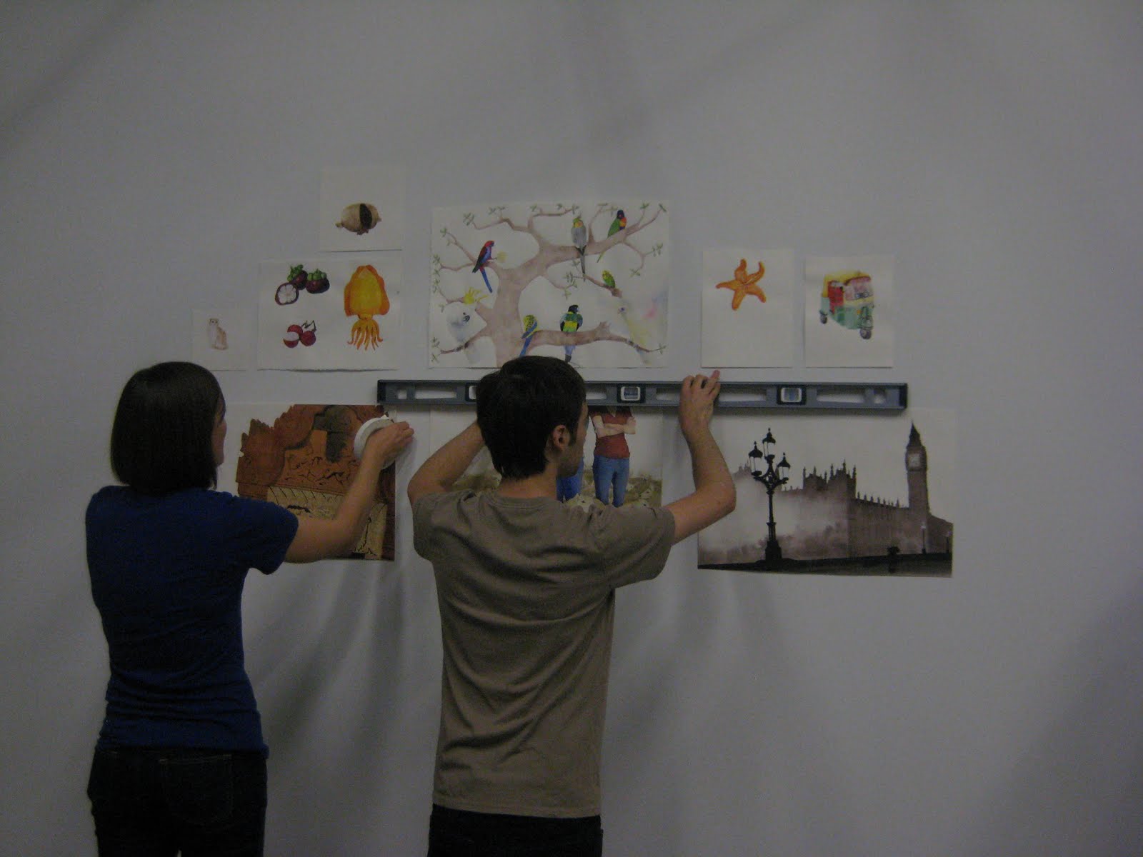
Book Show: Hanging to Opening

Hey there folks!

Many thanks to everyone who came out for the opening reception of the Book Show. It was a marvelous evening filled with lovely people and fantastic artwork. Half of the show has already come down; my book comes down on Monday. Things are wrapping up, and as usual, photos from the last couple of weeks are long overdue.

Hanging day was super exciting. As a class, we've been watching the books grow from a tiny nugget of an idea. It was amazing to finally see all of the work finished and framed and the books printed and bound.

Decisions, decisions...

Placing and measuring...


Watching things start to go up...


Could it be a show?

It's up!


The book:


Opening reception...


Thanks again to everyone for coming out.

For those of you in the NY area who still want to catch a bit of the show, you can still do so this weekend. The gallery is located in SVA's main building at 209 E 23rd Street. And for those of you who expressed interest, I'll be selling full and half size prints of all of the spreads in the book. Drop me a line for sizes and prices.

Cheers!

Inspiration: Tony DiTerlizzi

A while ago I did an "inspiration" post about Giselle Potter, and I got a lot of good feedback from folks about showing sneak peaks of my illustration and art faves. So, I've decided to do a post like this once a month in order to spotlight some of my major influences.

And who better to start with than Tony DiTerlizzi? He is in a nutshell one of the reasons I went to art school. One of my all time favorite kids' book illustrators, he imbues his work with imagination and heart, referencing greats like Arthur Rackham and Norman Rockwell (some of my favorites).
I first discovered Tony's work when I was in college. In Northampton, MA, there's an outstanding art gallery, the R. Michelson Gallery, on Main Street. On a whim, I stopped in to look around. The gallery featured some great work, but when I saw that it had an entire section devoted to children's book art, I was hooked. On that first visit, I discovered paintings from Tony's book Jimmy Zangwow's Out of this World Moon Pie Adventure hanging in the back room. Just the title! Awesome, non?


The illustrations were richly colored and imaginative. Each one was a masterpiece in gouache.


Of course, I rushed to the library to check out his others books. He had also illustrated a gorgeous black and white adaptation of The Spider and the Fly.


And Ted, a loony and endearing picture book about a boy and his imaginary friend.


Later Tony teemed up with author Holly Black (Tithe: A Modern Faerie Tale among others) on The Spiderwick Chronicles. Here his work shifted from full color gouache paintings to watercolor paintings - cover and frontispiece - and ink spot illustrations. I fell in love with the line quality of this work...

...and with his use of watercolor and a muted palette.


Rather versatile this Mr. DiTerlizzi.

Tony's work is beautiful, but the elements that I believe are truly key are both his imagination and his understanding of character. Every character in his illustrations has a personality and a life. Each one says something in his/her posture, gesture, facial expression, clothing... it's all in these careful details.


Honestly, I only have good things to say about him... even how nice he is. Yes! Dear readers, one of the reasons behind this post is that I actually met Tony today. Tonight there was an event at Books of Wonder to promote his new book, The Search for WondLa. (Note about the bookstore... it is an AMAZING children's bookstore in NY, and it's attached to a cupcake bakery. What could be better?! Seriously, get off of your computer and go!) But back to the book... I haven't yet read it, as it came out today, but I do have a signed copy waiting for me on my night table. The illustrations are similarly excellent and in a style that reflects the genre. It's a new departure - ink and digital coloring - but from what I've seen thus far, they're beautiful.


So, lovely readers, I urge you to check out Tony's work. As most of us in illustration-land do, he has both a blog and a website. And as I mentioned earlier, not only is Tony an amazing artist, but I can also state with certainty, he is super nice...

Comic Feature!

Hey there everyone!

I've been so intensely immersed in prepping for the book show, the comic class already feels ages ago. Regardless, Jessica Abel (one of the professors of my summer comic class and author of the graphic novel La Perdida and the how-to book Drawing Words, Writing Pictures) wrote a feature on her blog about the work I did this summer. Woah!

Take a looksee!


Special thanks to Jessica for the great spotlight article and of course to her, Tom and Keith for an incredible summer class.

DONE!

It's done!!!

Believe it or not, but it's done. It's sewn, it's glued, it's end-papered, it's trimmed, and it's bound! The pictures are matted and framed and all ready for hanging on Tuesday, and the business cards and promotional postcards are all designed, ordered, and on their way.

Alas, no images of the book yet. It may be done, but the glue is still on the wet side... pictures to come.

But! In the meantime, some more shameless self-promotion.

Could it be...

Could it possibly be...?

It would seem, dear readers, that my book may very well be coming together. It's been a harried few days. I've been at the studio every day this week doing final corrections to the art, reworking the text, hand-lettering, scanning, photoshopping, and laying everything out in InDesign. Whew. Just listing all of it is exhausting. Despite one slight mishap, everything is going rather well.

As for the "slight" mishap... I spent 6 hours scanning all of the artwork on Saturday only to make a horrifying discovery early Sunday morning. Since I had all of the raw files on my hard drive, I decided to work from home. Alas, when I opened the files, I discovered that each and every image had horrible lines and banding. ACK! I wrote a hasty, stress-induced email to the ever amazing P - computer-guru and studio-tech guy - who came into the studio and took all of the scanners apart and cleaned the scanner heads. Amazing, no? Anywho, after the heads were cleaned, I re-scanned everything and tada! No banding! Admittedly the loss of the 6 hours of work was traumatic, but it all worked out in the end. (Thank you P!)

The layout for the book is 90% done. All that remains is to format the title page, actually come up with a title, letter the title page, design the cover, and finally print and bind the book.

Because all of this layout business isn't really exciting, image-wise... I shall leave with you a new piece from the book.

The Carousel


And again, for the NYers, I hope you'll consider coming to the opening. If you can't come to the opening, let me know. The exhibit will be up for a bunch of weeks, so provided I have some free time, I'd be happy to arrange a private tour and show you around.

Until next time!

Book Show!


Hey there everyone!

The school year is just around the corner, as is the book show!

It has been a busy couple of weeks. After wrapping up the comic class and launching the snazzy new website, I dove right back into the book project, and finally FINALLY last week I moved into a bright shiny brand spanking new space at the studio. It's marvelous. Pictures to come.

So these past bunch of weeks have been work, work, and some more hard work; I finished two new spreads, doctored two old spreads, scrapped and rewrote the manuscript yet again (for the third, fourth, eighth, twenty-fifth time), played with some text treatment, scrapped a finished spread, redrew a new one, and am currently finishing up what I hope (fingers crossed) is the last spread in the book. I only have about half of it painted, but here's a sneak peak. (Pardon the low quality... my crappy little camera seems to be on the fritz.)


With this last spread nearly done, the book finally feels like it's coming together. Next steps: cover design, scanning, formatting, text-placement, printing, and binding! It's certainly going to be a busy September.

That being said, the book show is going to be amazing, and I hope that those of you who live nearby will consider coming!

Websuccess!

And it's done!
(Well nearly... bells and whistles to come, but for the moment, we have lift-off!)

Redesign!

Yes, my fabulously astute readers, Hogwash & Nonsense looks a bit different. Quite observant of you!

Since finishing the comics class, I have not yet taken a (much-needed) break, but have spent the past nine hours or so working on redesigning my website (read: alternately staring at the computer screen until my eyeballs glaze over and smashing my head against the keyboard).

Sigh.

But, in anticipation of the redesign (and in order to once again feel like a competent human being) I made some changes to the ole blog.

So sit tight and hold onto your hats... it's going to be exciting!

August and Everything

And it's August.

Dear readers, I have been entirely delinquent with my summer updates, but the comic class has kept me so busy that there has been time for little else. Excuses, excuses... I know. But to give you an idea, since class last Tuesday, I worked seven days this past week, putting in 12 hours on Wednesday, 10 on Thursday, 6 on Friday, 6 on Saturday, 8 on Sunday, and - for the final push - 12+ yesterday.

And now it's over.

For the final critique today, we had to have our projects, not only finished, but printed and bound into mini-comics. I'm not even going to go into the craziness that was yesterday, which involved Milton Glaser, not one but two defunct Staples, two small copy shops (one closed, one nearly closed), $8 worth of 11x17 paper that I couldn't even use, and finally a heroic rescue by my dear roommate's wonderful little (albeit oddly calibrated) printer. But as I said, it's over, and as such, I figured time for a long overdue post. (I'm giving you fair warning, this is a long post, but it is image-heavy... so consider yourselves thusly prepared...)

In my last post, I talked a bit about process and page 1 (now 3) of my comic, and I have the final version of that page to show you. When we last left off, I talked about inking and reworking my style to better fit the story. To recap... I redid my first page entirely. The first inking looked something like this:


And then the entire page was revised to better advance the story. The sketch for the revised page:


And... drum roll pleeeeease... the final inked version of this page:

Clearly I didn't just go from straight pencils to 4,209,302,125 inked in bricks. There was definitely a stage of very simple outlines followed by a second stage with some hesitant, very tentative gray hatched lines... One of my greatest weaknesses has always been adding enough darks into a black and white piece - both solid black and darker grey tones. I struggled with this during the course of the class and through the inking process... but Jessica, Tom, and Keith were an amazing help. Each week we brought in photocopies to pass out to our classmates for workshopping. Tom suggested that I take the left over photocopies and use them for experimenting. I took his advice and - for a bunch of the pages - scribbled in loads of ink and pencil, trying to find where best to add spots of dark before ever touching the final piece.

For example:

On (actual) page 1, I first started playing just with thicker outlines around some of the faces to try to pop them out of the page. I realized, however, that I wanted a much darker feeling to the piece. A darker outline wasn't going to cut it.


So I took a pencil and scribbled away...


Much better. So with a little bit of courage and a somewhat shaky hand to start out, I grabbed a pen and my good paper...

Another process set... on page four, here's a brief progression from pencils:


To the first inking:


To the final page:


I can't say it enough... the class was an unbelievable learning experience, and my drawings improved by leaps and bounds over the past eight weeks. And so I shall leave you with a few more images and a handful of lessons learned:

1. No drawing is precious. Many a panel will be sacrificed to the gods of storytelling (even if it means - very sadly - cutting a choice scene of your main character pole vaulting ninja-style over a bunch of bear traps and another that you might love for no good reason at all, except maybe that it reminds you of an old school Alice in Wonderland illustration)...


If they don't help the story, out they go.

2. Don't be afraid of the dark...

3. Or the grays...

The end.

Craft Interlude: Challah


I woke up this morning wanting to make something with my hands...

so I did...


Comics and Graphic Novels: Process Work

Happy hot weather dear readers!

Apologies for the month long hiatus. My weekly workload has left little time for anything other than actual homework. This week, however, I seem to be on track with my assignment and thus find myself with an iota of extra time for an update.

The comic class has been crazy intense but amazing. Tom, Jessica, and Keith are great teachers who give great feedback. Each week we have two pages to pencil and a third to ink - read: buckets of work. But!! Because of the heavy workload, I'm nearly through a ten page mini-comic that will eventually serve as the introduction or prequel to a graphic novel for kids.

The first step in the process was a series of thumbnails - essentially ten detailed pages laying out the entire story. After a first round of editing, I ended up completely revising my story and thumbnails, redrawing them entirely. In the new version, I condensed the first three pages into one. With only ten pages for the entire story, I had to find a better - read, more concise - way to communicate the beginning.

Page 1


Page 2


Page 3


New page 1!


After the revisions, I transferred this initial thumbnail (drawn on regular computer paper) onto a piece of 14 x 17 bristol board and tightened up the original sketch in pencil. (Apologies... the quality of this image isn't great... the erasing leaves some smudgy bits on the paper.)


Next step: inking!

Never having inked anything before, I decided to try inking the page using a brush.

First I drew in borders and began laying in any text.


And after all of the text was in, I began inking the rest of the drawing.


Finally, once the entire image was inked (and I forgot to take a photo of this particular step... oops!), I began adding textures (wood grain, cobblestones, etc), laying in light washes, and darkening bits of the image to balance the amount of white, black and grey throughout.


Until finally:


Having never inked anything before, I was unsure about the washes and shading. Ultimately I decided to stop here and bring the page to class for some advice before continuing. It wasn't a bad decision. Because of the feedback from both my teachers and classmates, I actually ended up reorganizing the comic a second time in order to better tell the story. This page will still show up in the final version, but as the third page rather than the first. Likewise, when I inked the second page, I did so in an entirely different style - with a nib rather than a brush - that I believe works better for the overall mood of the story. The style works better, but it meant that I woud have to redo the whole page. But again, not a bad thing at all. I think the new page tells the story better than the old one. I haven't quite finished with the pencils for this page (you can still see some perspective lines I need to work out in the first panel), but here is the page in progress:


So there's a little peek into the comic process. I've never done a comic before; it's been a lot of fun, but it is so soo sooooooo much work. There is a ton of drawing and refining in each and every page, and the pace is grueling. That being said, I am definitely learning a ton, not only about comics, but also about my own process - how I work and how I draw - and likewise about using ink with both a nib and a brush.

And speaking of that ink and brush... now, dear readers, I should get back to my drawing board.

Until next time!