Showing posts with label inking. Show all posts

Forward-ing Work

Hey there everyone,

It's been a fun-filled, exciting sort of weekend. I hope that all of you on the East Coast are well-equipped with extra batteries for flashlights, candles, and water. Stay safe! As for me, I'm actually in Massachusetts right now... and for the next few days. I came up for the weekend, and as of yesterday, all trains and buses were cancelled due to Sandy-related weather. I'll be here for a bit longer, but that's fine by me. I have excellent company and plenty of sketchbook pages to fill.

In the meantime, if you need some extra reading, the latest article in the Forward's InsideOut series is live!

Check it out.

If you're looking for older articles, you can find the full list here.


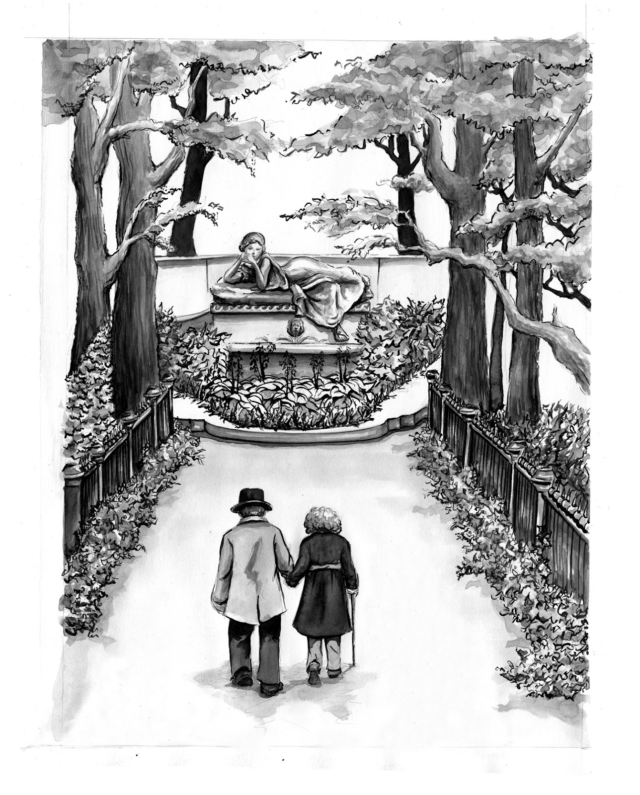
This week's illustration involved populating a city block with a variety of characters. I really enjoy working with a wide variety of materials. Most of the time I use pencil and paint for my children's illustration, so it's nice to switch things up and play with ink for these pieces.

Thanks to Kurt and Naomi for their art direction.


Freelance for the Forward

Hey there blog readers!

Exciting things. I recently did a job for the Forward (or פֿאָרווערטס , for the Yiddish speakers among you). Because it's the 100th anniversary of the sinking of the Titanic, loads of news sources are running articles. The Jewish Daily Forward ran a bunch of interesting pieces, and one in particular about two passengers on the ship, Isidor and Ida Straus. Straus, a NY resident, was co-owner of Macy's department store. On the night the Titanic sank, both Isidor and his wife refused places in the lifeboats and were last seen sitting on the deck together. In addition to a place in Woodlawn cemetery, there's a memorial park dedicated to the couple on the Upper West.

My favorite part of the job was doing some outdoor sketching uptown at Straus Park. These are my two favorite sketches from the afternoon.


I also spent some of the afternoon following around older folks along Broadway.


Once I had some decent reference, I went home and started playing with possible compositions. These are five of the samples I sent in.


Once we settled on a sketch, I did a tightened version so the folks at the Forward had a place-holder as they worked out the section layout. 


Before starting in on the final illustration, I inked a small sample, just to play around and loosen up.


Ink!


And finally, color.


Exciting things, indeed.

You can check out the full article here.

Many thanks to Dan Friedman and Lil Swanson at the Forward and Liz Marcus for putting me in touch.

Double Self-Portrait

So this post requires a bit of pictorial explanation before I post the actual piece.

For those of you who I haven't seen in recent days, while I was out in Minneapolis visiting a friend, I chopped off all of my hair. (Do not despair, I donated it.)

Haircut:

I had a particularly inspired working day the other morning...
and yes, I work better in a silly hat


Gratuitous cat photo.

So pre-haircut, I had started a self-portrait project for a contest. The contest is being run by Tony DiTerlizzi's facebook fan page. The title is "Re-imagine Yourself", and the goal is to create a portrait of yourself within one of the many DiTerlizzi stories. There was no end to the possibilities, and the brainstorming itself was incredibly fun; I almost had too many choices.

In any case, I finally settled on a self-portrait as an imaginary monster in Tony's hilarious and ridiculous alphabet book, "G is for One Gzonk", using my crazy ginormous hair as a jumping off point. I created a monster not only entirely engulfed by the crazy ocean of red, but also whose hair becomes a character itself, creeping about and nabbing odds and ends and even other creatures from the original book.

But then I cut all of my hair off.

So I went back to the portrait, did a little revision, and voila double self-portrait, pre- and post-new-do.


The Rumprunkus
Double Self-Portrait
in the style of Tony DiTerlizzi's
"G is for One Gzonk: An Alpha-Number-Bet Book"

The rhyme in it's entirety:
The Rare and Red Rumprunkus
Is barely visible, you see.
Covered with a vibrant mane,
Her hair's as wild as can be.

That monstrous RED hides many things -
It hides baubles, bits, and bangles.
Even ribbons, rocks, and riches
Are caught up among the tangles.

But beware the creeping tendrils,
As they slither through the air.
With a strange life of their own,
They might drag you under there.

Playing around

Just doing some experimenting...

Drawing Class

Hope everyone out there had a good Thanksgiving.

November has sped by in a haze of sneezing and coughing. I spent about half of the month sick and the remainder in front of the computer working on actionscript for the digital version of my thesis. More about that another day...

Today, however, I wanted to post a couple of images from my drawing class. Every Friday, I have five hours of drawing, either on location around the city or in the studio with live models. It's a great class, and it's been an opportunity for loads of experimentation.

Our on location days have included trips to Governor's Island, 50 stories up in a building overlooking the World Trade Center site, the Brooklyn Botanical Gardens, Gleason's Boxing Gym... it's been amazing. Here are some highlights:


My classmates looking down out over the city -


Drawing the Woolworth building -


Skyline (looking North) -


Word Trade Center site -


Drawing from the South side of the building -


After such a detailed drawing, I wanted to do something looser... quick ink drawing of my classmates and the interior of the space -


Unfinished drawing, Woolworth building -


Patrick Dougherty sculptures at the Brooklyn Botanical Garden (If you haven't seen them yet, check them out! They're amazing... he also did an installation at Smith during my first year.) -


Erin drawing


Left-handed drawing to warm up... my pen ran out of ink halfway through -


Drawings of the sculpture -


Detail page from the cactus room in the greenhouse -


Back in the studio with three models. Warming up with charcoal -


Playing around with ink (unfinished) -


Tighter pencil drawing -

August and Everything

And it's August.

Dear readers, I have been entirely delinquent with my summer updates, but the comic class has kept me so busy that there has been time for little else. Excuses, excuses... I know. But to give you an idea, since class last Tuesday, I worked seven days this past week, putting in 12 hours on Wednesday, 10 on Thursday, 6 on Friday, 6 on Saturday, 8 on Sunday, and - for the final push - 12+ yesterday.

And now it's over.

For the final critique today, we had to have our projects, not only finished, but printed and bound into mini-comics. I'm not even going to go into the craziness that was yesterday, which involved Milton Glaser, not one but two defunct Staples, two small copy shops (one closed, one nearly closed), $8 worth of 11x17 paper that I couldn't even use, and finally a heroic rescue by my dear roommate's wonderful little (albeit oddly calibrated) printer. But as I said, it's over, and as such, I figured time for a long overdue post. (I'm giving you fair warning, this is a long post, but it is image-heavy... so consider yourselves thusly prepared...)

In my last post, I talked a bit about process and page 1 (now 3) of my comic, and I have the final version of that page to show you. When we last left off, I talked about inking and reworking my style to better fit the story. To recap... I redid my first page entirely. The first inking looked something like this:


And then the entire page was revised to better advance the story. The sketch for the revised page:


And... drum roll pleeeeease... the final inked version of this page:

Clearly I didn't just go from straight pencils to 4,209,302,125 inked in bricks. There was definitely a stage of very simple outlines followed by a second stage with some hesitant, very tentative gray hatched lines... One of my greatest weaknesses has always been adding enough darks into a black and white piece - both solid black and darker grey tones. I struggled with this during the course of the class and through the inking process... but Jessica, Tom, and Keith were an amazing help. Each week we brought in photocopies to pass out to our classmates for workshopping. Tom suggested that I take the left over photocopies and use them for experimenting. I took his advice and - for a bunch of the pages - scribbled in loads of ink and pencil, trying to find where best to add spots of dark before ever touching the final piece.

For example:

On (actual) page 1, I first started playing just with thicker outlines around some of the faces to try to pop them out of the page. I realized, however, that I wanted a much darker feeling to the piece. A darker outline wasn't going to cut it.


So I took a pencil and scribbled away...


Much better. So with a little bit of courage and a somewhat shaky hand to start out, I grabbed a pen and my good paper...

Another process set... on page four, here's a brief progression from pencils:


To the first inking:


To the final page:


I can't say it enough... the class was an unbelievable learning experience, and my drawings improved by leaps and bounds over the past eight weeks. And so I shall leave you with a few more images and a handful of lessons learned:

1. No drawing is precious. Many a panel will be sacrificed to the gods of storytelling (even if it means - very sadly - cutting a choice scene of your main character pole vaulting ninja-style over a bunch of bear traps and another that you might love for no good reason at all, except maybe that it reminds you of an old school Alice in Wonderland illustration)...


If they don't help the story, out they go.

2. Don't be afraid of the dark...

3. Or the grays...

The end.

Comics and Graphic Novels: Process Work

Happy hot weather dear readers!

Apologies for the month long hiatus. My weekly workload has left little time for anything other than actual homework. This week, however, I seem to be on track with my assignment and thus find myself with an iota of extra time for an update.

The comic class has been crazy intense but amazing. Tom, Jessica, and Keith are great teachers who give great feedback. Each week we have two pages to pencil and a third to ink - read: buckets of work. But!! Because of the heavy workload, I'm nearly through a ten page mini-comic that will eventually serve as the introduction or prequel to a graphic novel for kids.

The first step in the process was a series of thumbnails - essentially ten detailed pages laying out the entire story. After a first round of editing, I ended up completely revising my story and thumbnails, redrawing them entirely. In the new version, I condensed the first three pages into one. With only ten pages for the entire story, I had to find a better - read, more concise - way to communicate the beginning.

Page 1


Page 2


Page 3


New page 1!


After the revisions, I transferred this initial thumbnail (drawn on regular computer paper) onto a piece of 14 x 17 bristol board and tightened up the original sketch in pencil. (Apologies... the quality of this image isn't great... the erasing leaves some smudgy bits on the paper.)


Next step: inking!

Never having inked anything before, I decided to try inking the page using a brush.

First I drew in borders and began laying in any text.


And after all of the text was in, I began inking the rest of the drawing.


Finally, once the entire image was inked (and I forgot to take a photo of this particular step... oops!), I began adding textures (wood grain, cobblestones, etc), laying in light washes, and darkening bits of the image to balance the amount of white, black and grey throughout.


Until finally:


Having never inked anything before, I was unsure about the washes and shading. Ultimately I decided to stop here and bring the page to class for some advice before continuing. It wasn't a bad decision. Because of the feedback from both my teachers and classmates, I actually ended up reorganizing the comic a second time in order to better tell the story. This page will still show up in the final version, but as the third page rather than the first. Likewise, when I inked the second page, I did so in an entirely different style - with a nib rather than a brush - that I believe works better for the overall mood of the story. The style works better, but it meant that I woud have to redo the whole page. But again, not a bad thing at all. I think the new page tells the story better than the old one. I haven't quite finished with the pencils for this page (you can still see some perspective lines I need to work out in the first panel), but here is the page in progress:


So there's a little peek into the comic process. I've never done a comic before; it's been a lot of fun, but it is so soo sooooooo much work. There is a ton of drawing and refining in each and every page, and the pace is grueling. That being said, I am definitely learning a ton, not only about comics, but also about my own process - how I work and how I draw - and likewise about using ink with both a nib and a brush.

And speaking of that ink and brush... now, dear readers, I should get back to my drawing board.

Until next time!